Clustering GPS trip data
Fri Sep 11 2020tags: programming public internship consulting inzura
Introduction
Over the past month we have developed Inzura's data science capabilities by creating a data processing library and formalising a data science workflow. I used the library and workflow to cluster Inzura's corpus of over 2 million anonymised trips.
The general data science workflow I have set out is the following:
- Obtain the data
- Clean the data
- Explore the data
- Repeat (try various different approaches to get best results):
- Normalise and reduce the dimensionality of the data
- Perform the clustering on the reduced data
- Inspect the clusters to see if they make sense
Step 1. Obtaining the data
First, I processed the trip data. Recall that a trip is an matrix where T is the length of the trip. Because many of the trips have different trip lengths, it's impossible to cluster them in this form. I therefore needed to calculate summary statistics for the trip so I could compare them to each other.
After consultation with Richard and David, I wrote functions to calculate
85 different metrics on the formatted.json data. Some of these metrics include:
median absolute velocity, number of stops normalised by trip duration,
maximum tangential acceleration, bendiness (the sum of turning degrees per second
normalised by trip distance). Importantly, this reduces the dimensionality
of any trip from to a constant , which makes it much
easier to do analysis on.
Once I had come up with the metrics and the functions to calculate them, I had to calculate the metrics for all of the trips. As we had more than 2 million anonymised trips, processing all of them in a reasonable amount of time would have to leverage parallel computation.
To this end, I wrote a multiprocessing library with Richard's help that made use of the Ray library. The library automatically handles the distribution of tasks to processes. Because we didn't want to lose any progress if e.g. the machine failed, the library also saves your progress so you can stop and restart the job anytime, and logs all errors automatically. I have already extensively documented the library and how to use it elsewhere and will not repeat it here.
Processing all the trips on the old bigbeast took several days, despite a ~12x speedup from parallelisation. This really hammers home the fact that we needed parallelisation, or we might still be waiting for the data...
Step 2. Cleaning the data
After all the trips had been processed we were left with a dataset with ~2 million rows and 85 columns. I plotted histograms for each column of the data to visualise the distributions. Doing so allowed me to discover that the data was quite dirty. For instance, there were trips where the average median velocity was something like 1000m/s, which is impossible unless the person was on a rocket. This happens because GPS data can sometimes cut in and out when signal is bad (e.g driving through a tunnel), which leads to an artificially inflated velocity/acceleration/whatever have you score.
I re-plotted the data after removing trips that were patently absurd (average velocity of > 160km/h, maximum acceleration/decceleration of more than 3Gs, trips <30s long) and observed that most metrics followed a power law distribution, with some following a normal distribution. Velocity and acceleration tended to follow a normal distribution while bendiness/stoppiness/trip length followed a power law distribution. This makes sense intuitively.
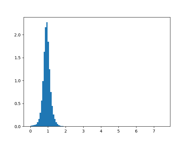
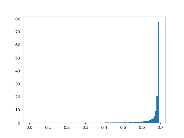
Here are a few histograms of the filtered data:
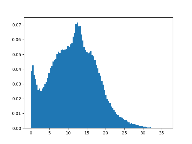
Median absolute velocity (filtered)
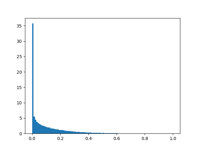
Idleness (filtered)
Step 3. Exploring the data
To better understand the relationships between the features, I plotted a correlation matrix.
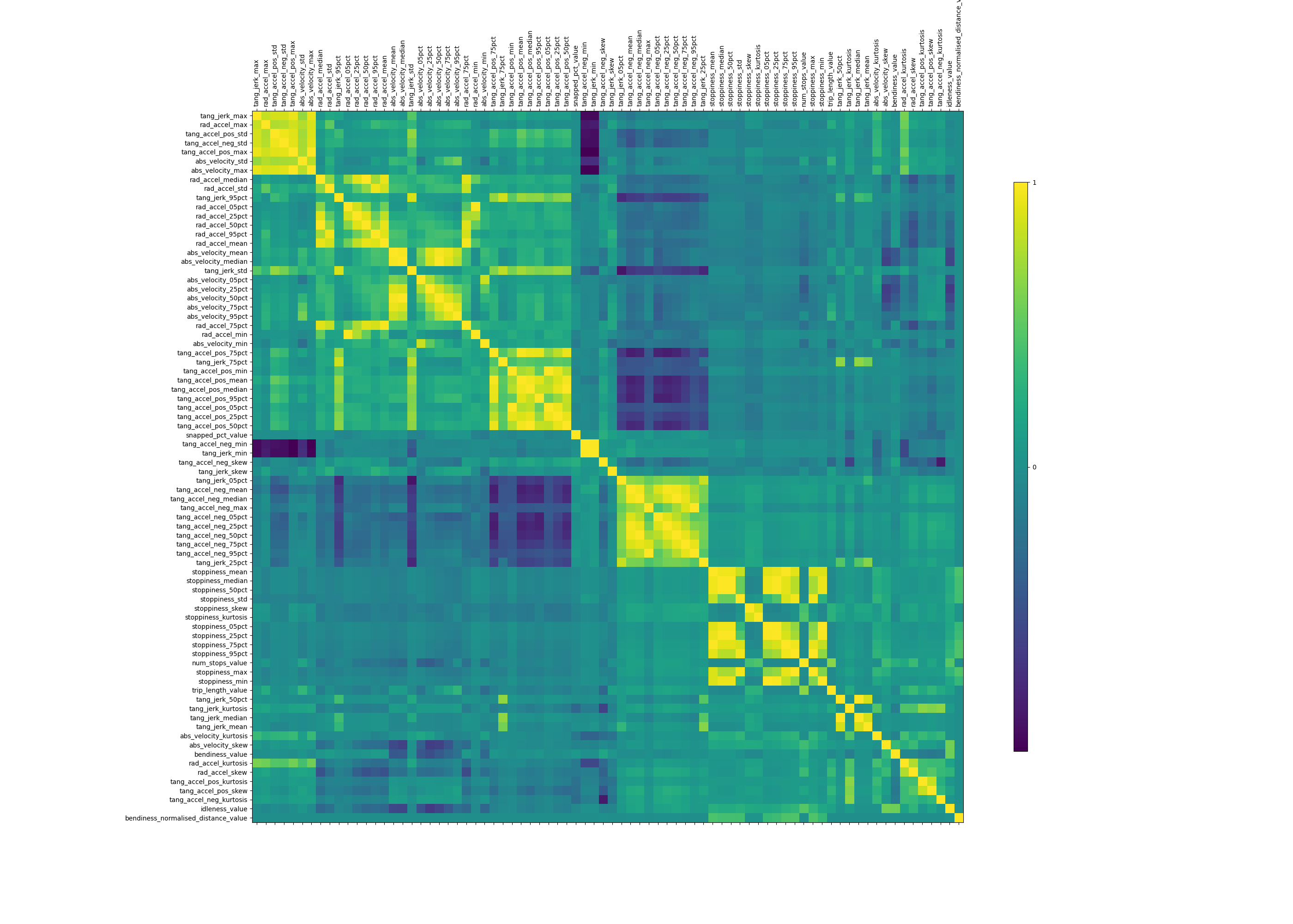
As expected, the different summary statistics of the same underlying data were strongly correlated with one another (median absolute velocity is very highly correlated with 75th percentile velocity, for instance). But there were also some nontrivial correlations. For example, trips that were more "bendy" (measured by the sum of turning degrees normalised by total trip distance) also tended to be more "stoppy" (measured by the number of times a vehicle stops for more than 5 seconds normalised by total trip distance). This makes a lot of sense: This correlation picks up two different trip types: "highway" trips where cars don't stop or bend much at all, versus "urban" trips where cars stop and turn a lot.
Step 4. Reducing and normalising the data
We have 85 different metrics, too many to run clustering on and get results on. This is because clustering algorithms don't work well with high-dimensional points due to something called the curse of dimensionality (but see this CV post for an interesting counterpoint to this).
Essentially, "in high dimensions all examples look alike".
Suppose, for instance, that examples are laid out on a regular grid, and consider a test example . If the grid is d-dimensional, ’s nearest examples are all at the same distance from it. So as the dimensionality increases, more and more examples become nearest neighbors of , until the choice of nearest neighbor (and therefore of class) is effectively random
We can fix this by reducing the number of features we consider. I used two different ways: first, by reducing the dimensionality of the data using principal component analysis (PCA), and secondly, by using my domain knowledge of the problem to do manual feature selection.
Principal component analysis (PCA)
My initial approach reduced the dimensionality of the data using PCA. Recall that we have a ~2 million * 85 data set where many features are very highly correlated with one another. It's likely that we would be able to explain a large proportion of the variance without using all of the features.
PCA is sensitive to scale so I first had to normalise the data.
After removing absurd data,
I used scikit-learn's MinMaxScaler to scale all the metrics to lie between 0 and 1.
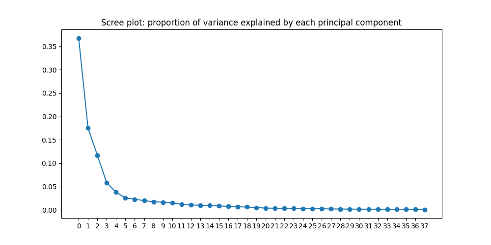
Then I ran PCA to generate a "scree plot" (shown below), which shows the proportion of
variance explained by each principal component. I found that just three
components were sufficient to explain more than 50% of the variance, and
37 components were sufficient to explain more than 99% of the variance.
 /
/
Manual feature selection
While the factor analysis was successful, I worried that the components derived by PCA (and the resulting clusters) would be uninterpretable. I therefore also did manual feature selection, selecting the following six values:
- Median absolute velocity
- Number of stops normalised by trip duration
- Percentage of GPS points that were snapped to a road link
- Max radial acceleration
- Max positive tangential acceleration
- Idleness
I chose these features because I thought they would be the most informative. While I could have chosen more features that were also likely to be informative (e.g. bendiness and maximum negative tangential acceleration), the more features one chosses, the more likely one will run into the curse of dimensionality, and the poorer the clusters will be.
I did not remove outliers when doing manual feature selection, instead choosing to take the transform:
normalised_df = filtered_df.apply(np.log1p)I plotted each metric's distribution after taking the log x+1 transform
and the MinMaxScaler to standardise between 0 and 1.
The data was surprisingly well-behaved.
Both radial and tangential acceleration seemed to conform to a normal distribution,
while number of stops and percentage snapped followed a power law.
Absolute velocity seemed to follow some sort of truncated normal distribution,
which makes sense because speed limits exist (both legal and physical).
Here are the six histograms:
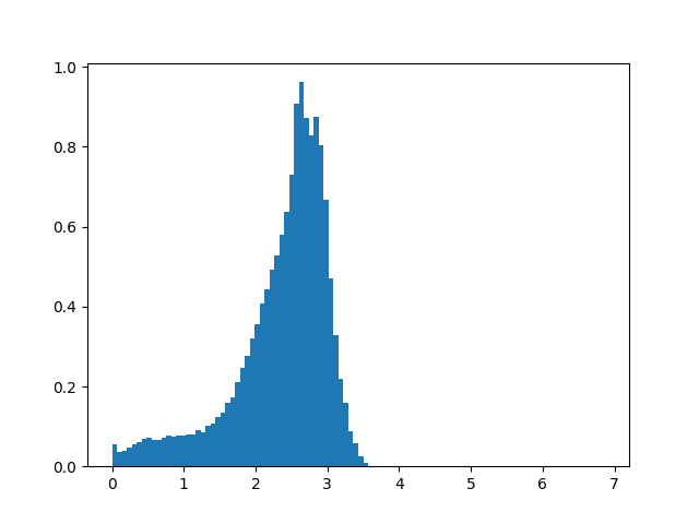
Median absolute velocity
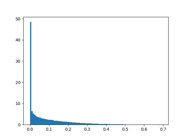
Idleness
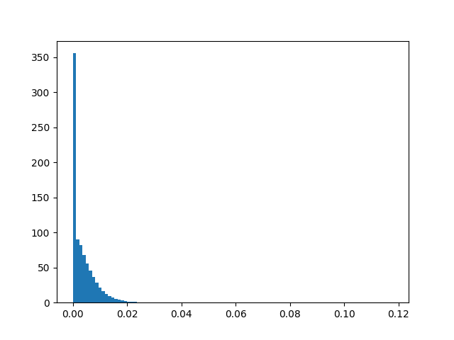
Number of stops, normalised by trip distance
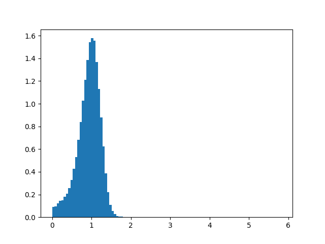
Maximum radial acceleration
Maximum positive tangential acceleration
Percentage of snapped road links
Step 4. Perform clustering on the normalised and reduced data
After several false starts, and in keeping with the KISS principle, I decided to use the simplest clustering algorithm possible---k-means clustering. The main problem with K-means clustering is that one must specify the number of clusters. After discussion with Richard and David, we decided that the a priori number of clusters should be six (walk, car, bus, train, plane, ferry), and so I used that number [1]. As usual, scikit-learn provides a one-liner:
kmeans = KMeans(n_clusters=6, random_state=0).fit(y)After clustering the dataset, we need to visulise our clusters.
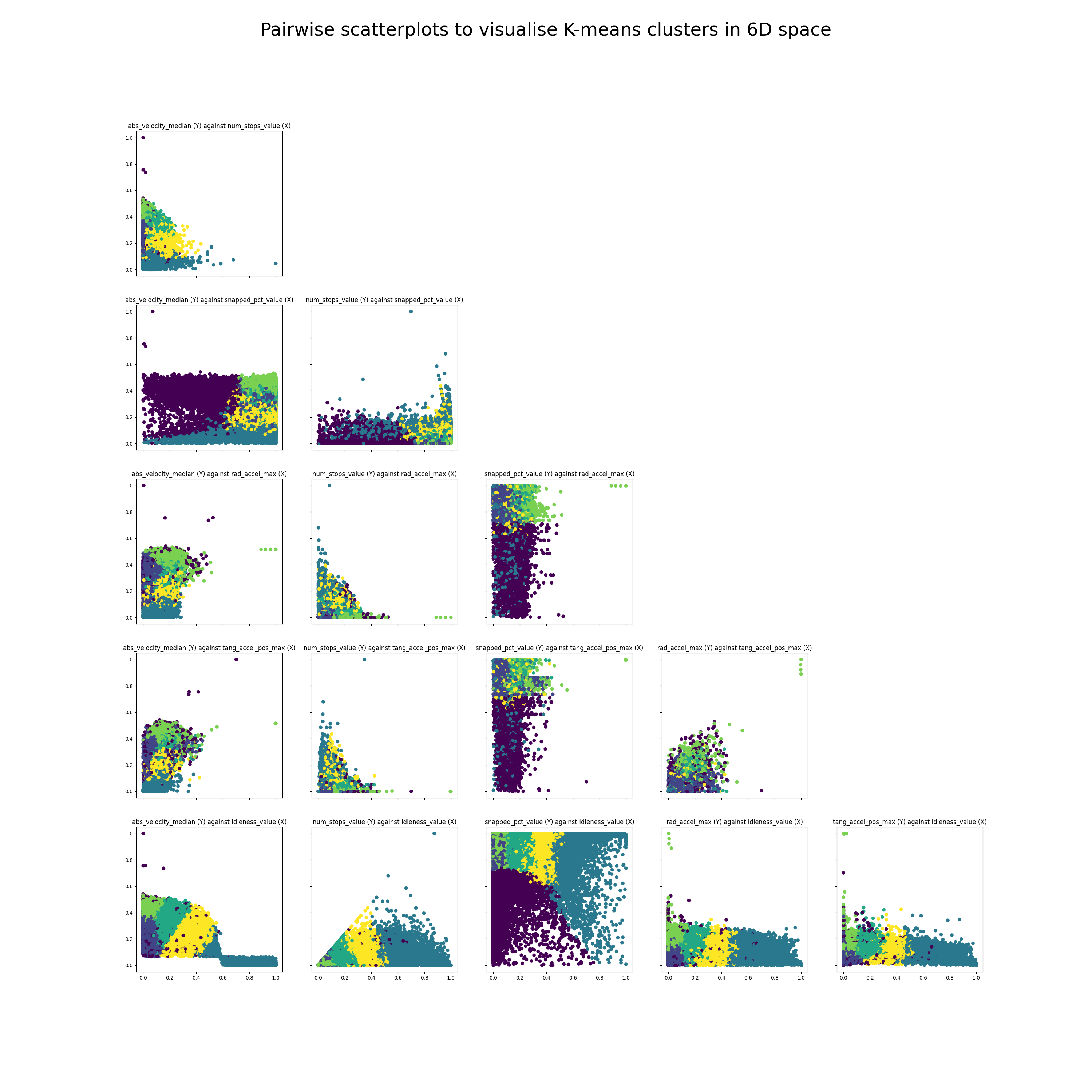
This is not a trivial task as our trips are in 6D space, and I know of no good way
to visualise high dimensional clusters. Instead, I took all possible pairs of
the six metrics and plotted each of them as a 2D scatterplot, which is much
easier to interpret.
There are scatterplots in total
(each metric has a scatterplot with all the other metrics),
but half of them are mirror images, so this leaves 15 total scatterplots.
I used matplotlib to create a lower triangular matrix of scatterplots,
and the results are as follows:
Although the actual clustering only took one line of code, there was in reality a significant amount of work that went into it. I ran into several dead ends that initially seemed promising, and I list them here.
Things that didn't work
Hierarchical clustering --- too slow
I first tried to use hierarchical clustering so that we didn't have to specify the number of clusters but this didn't work because hierarchical clustering runs in O(N^3) time, which is too slow for the number of data points we have. In fact, SciPy ran into a memory error when trying to do heirarchical clustering on just 1/10th of our dataset.
PCA and then K-means clustering --- too uninterpretable
As mentioned, I used PCA to reduce the dimension of the 85 or so calculated metrics and then performed K-means clustering on those reduced dimensions. While this seemed to work OK, it wasn't really that interpretable. I think this approach is probably the right way to go in the future. Right now, though, I would need to have a better understanding of how different types of trips look like so that I can manually inspect the clusters.
Step 5. Perform data analysis on those clusters
We've visualised the clusters. Now let's take a closer look at them and see what we can learn.
The first thing we notice is that there are outlier trips with high absolute velocity. This is by design as I wanted to cluster all of these outlier trips together with plane trips which also have a high absolute velocity. We also see in the second plot from the top left that there are a few outliers with high absolute velocity and almost 0 snapped percentage: these are likely either plane trips or trips with poor GPS data.
The second thing we notice is that the clusters don't seem all that great. While we can definitely see distinct clusters, the clusters seem to have significant overlaps. This could be because there are too many points to visualise, because 6D space doesn't map cleanly onto 2D space, or because the clusters themselves just aren't that great (more on this later).
The third thing to notice is that there seems to be a negative correlation between number of stops and maximum acceleration, as well as a negative correlation between number of stops and median velocity. You'll see this most clearly when looking at the second plot in the third row, num_stops_value (Y) against rad_accel_max(X). This is as we expect. The negative correlation between number of stops and maximum could be because cars making trips that stop more tend to be urban trips (slower) while cars making trips that stop less tend to be highway trips (faster). Or it could also be reflecting a difference in trip modality: buses tend to stop a lot and tend also to be slower/accelerate slower.
In order to know more about the clusters, I plotted the number of trips belonging to each cluster in the figure below.
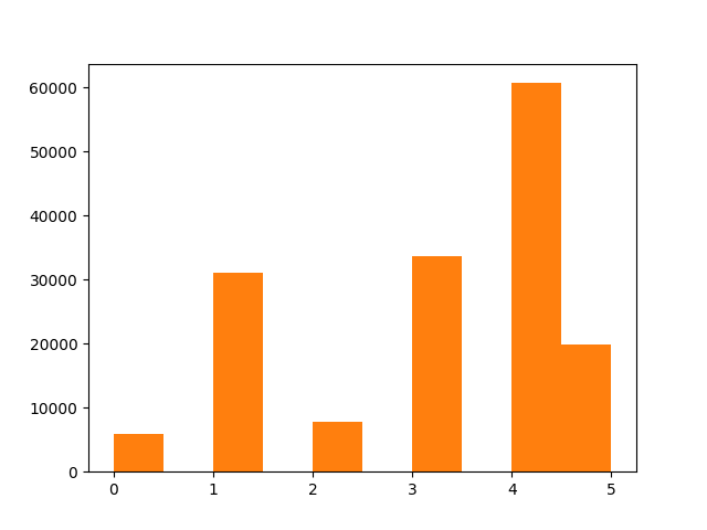
We can see that the clusters are unbalanced, which is a good thing, because the vast majority of trips in our dataset are car trips. However, they are not unbalanced enough ---they don't match our priors on how likely each type of cluster is likely to be. Of course, it would be quite unrealistic to expect the clusters k-means identified to coincide entirely with the clusters we care about.
Why didn't K-means give good clusters?
We've used the simplest possible clustering algorithm (a veritable workhorse), K-means clustering. However, there are many shortcomings with K-means clustering, which could be the reason why the clusters are not as good as we hoped.
K-means clustering may not do well with very uneven clusters
For instance, k-means may sometimes fail with uneven clusters. The following image shows an example where k-means fails to cluster correctly:
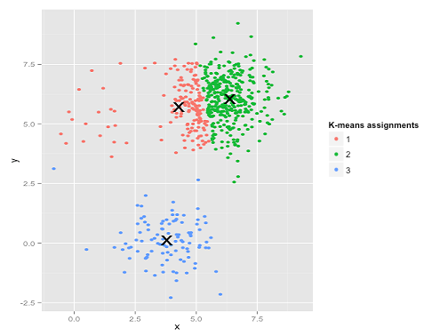
The reason is because the top-right cluster is very big and the top-left cluster is very small. So the k-means algorithm would rather forsake the loss of the small number of points at the top-left and use the "freed-up" cluster to decrease the loss in the big cluster.
I suspect that this is happening in our case. We have a tiny number of outliers (e.g. plane trips with high average velocity, low percentage snapped, etc.), and this should be in a cluster of its own, but K-means will not do that if the number of outliers is too small.
K-means clustering cannot deal with intracluster covariance
Two other shortcomings with K-means clustering are laid out very nicely in the following post.
The first shortcoming is that K-means clustering can't account for covariance.
One way to think about the k-means model is that it places a circle (or, in higher dimensions, a hyper-sphere) at the center of each cluster, with a radius defined by the most distant point in the cluster.
K-means doesn't work well if the clusters have some positive or negative covariance (such that the shape of each cluster is non-circular).
K-means tries to fit all points to a cluster even if they may be outliers
The second and more important difference is as follows:
Ideally, a clustering algorithm should be able to label points as outliers and not force-fit them into an existing cluster. While Gaussian mixtures can label points as not belonging to any cluster at all, K-means cannot do this, which means outliers will skew our cluster centers and thus result in incorrect results.
It would be helpful to have some sort of "confidence" in whether or not a particular trip belongs to any cluster at all, and if the probability is too low, label that point an outlier. Gaussian models do this:
The second difference between k-means and Gaussian mixture models is that the former performs hard classification whereas the latter performs soft classification. In other words, k-means tells us what data point belong to which cluster but won’t provide us with the probabilities that a given data point belongs to each of the possible clusters.
Ideas for future work
Using the fact that we have a corpus of guaranteed car trips for anomaly detection
We know that the vast majority of recorded trips (> 99%) are car trips. And we also have what is in fact a "ground truth" with the beacon started trips from company 5 and 11 (these are trips that are guaranteed to be car trips).
We should make use of this prior knowledge somehow! Our current unsupervised learning model doesn't make use of any of this information, which is a real waste.
We can do what is in fact a semi-supervised learning model (anomaly detection). In essence, this will flag any trips that are too different from the beacon started trips, be it walk/ferry/train/plane. These trips can then be flagged out and manually inspected, or some sort of model can be trained on them.
I believe that we can use Gaussian mixture models to implement this: see this article for a nonrigorous overview. A big advantage of using Gaussian mixture models is that we can explicitly set a priori prior probabilities of how likely any random trip will belong to a particular cluster.
Running PCA within clusters to compare the difference between intracluster and intercluster variance
Finally, here's an idea I got from a friend:
Do the clustering, subsample to a cluster and redo PCA on that cluster. That'll show how variance is differently explained between clusters and within a cluster.
For instance, if you had two clusters, and the PCA found that the loading on absolute velocity was high, and then you dialed into one cluster and ran PCA there, and the PCA there found that the loading on number of stops was high, then this would suggest that the variance between clusters was more due to abs velocity (e.g. plane vs non-plane) and the variance within a cluster was more due to number of stops e.g. buses stop a lot and cars tend not to -- but abs velocity doesnt vary as much between the two modes of transport.
Conclusion
Over the past month we have developed Inzura's data science capabilities by creating a data processing library and formalising a data science workflow. I used the library and workflow to cluster Inzura's corpus of over 2 million anonymised trips.
Our contribution is not just the results of the data analysis, but also the process that I have outlined here. With the library and the workflow established, future data science tasks will be more streamlined. We will be able to process any data, get more insights from it and evaluate the results very quickly in the future.
One possible method if the number of clusters was unknown a priori would be to plot the Bayesian and Aikeke Information Criteria (BIC, AIC), and just eyeball when the BIC plateaus. ↩︎